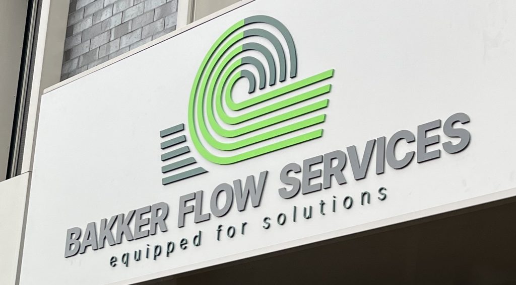
One week ago, we unveiled our new identity, but what went into choosing our new name and logo? Today, we’re excited to share the story behind it.
The name “Bakker Flow Services”
Our new name “Bakker Flow Services” better reflects our evolution and aligns with our mission to be the best designer and performer of technical solutions in the energy sector. Our subline is therefore “Equipped For Solutions” and represents all that!
Fun fact: our employees were directly involved in brainstorming and selecting the new name.
From our identity to our new logo “The Flow”
Our logo is a reflection of our identity. It is actually the mole that inspired the logo. This remarkable creature embodies flexibility, effortlessly moving both forward and backward.
Powerfull, despite it’s size, he continuously explores new paths. Native to Europe, the mole also symbolizes our goal-oriented mindset and determination.
Additionally, the flow symbolizes our continuous progress in the energy sector, aligning with our name. Each line represents one of our core pillars – New Energy, Oil& Gas, Industrial, Rental, Maintenance & Inspection.
Together, they represent our fresh new look, and we hope it resonates with you as much as it does with us.

